How It Works
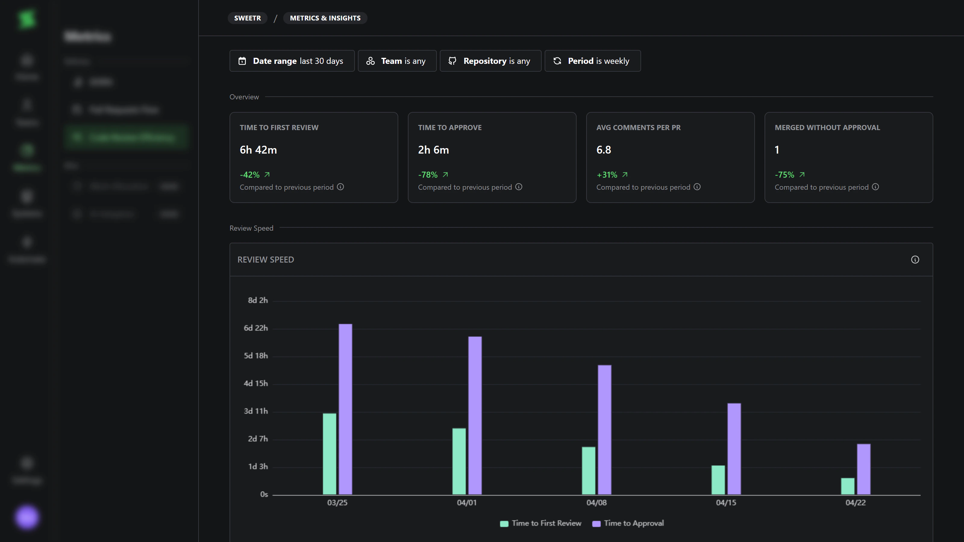
The Code review efficiency dashboard focuses on the review stage of the PR lifecycle. It answers three questions at once: how fast reviews happen, how deep they are, and who is doing them. All charts respect the same filters at the top of the page:- Date range — the window of PRs and reviews to include.
- Team — filter by PR author’s team membership. Multi-select.
- Repository — filter by repository. Multi-select.
- Period — group the time axis as daily, weekly, monthly, quarterly, or yearly.
Explore
KPIs
Review Speed
Team Overview
PR Size vs Comments
Review Distribution
Bad Practices
It’s very important to know how this data should not be used.- Do not evaluate review quality based on quantity.
- Do not stack rank developers by review count, speed, or comments.
- Do not obsess over a single KPI — drive review speed to zero and you’ll lose the value of review itself. Strive for a good balance of quality and speed.